Skip to main content
Search
Search This Blog
Renee Walden - Art & Illustration
Watercolour artist . Plein air painter . Teacher
Posts
Showing posts from 2024
Show All
October 10, 2024
nightscape in watercolour
October 04, 2024
a yellow bicycle
September 27, 2024
an old wooden barn
September 17, 2024
watercolour over coloured pencils
September 12, 2024
Autumn in Dublin Bay
September 10, 2024
using salt for texture in watercolours
September 05, 2024
how to paint still water in watercolour
August 23, 2024
a bumblebee
August 20, 2024
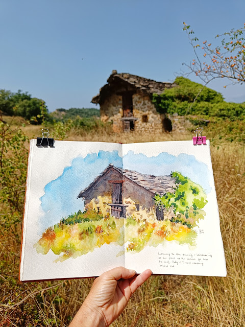
old ruin near home
August 11, 2024
rustic buildings series
August 09, 2024
bougainvillea framing a Greek chapel
July 28, 2024
watercolour whale
July 27, 2024
painting holiday in portugal - september 2025
July 23, 2024
hiking to see the mountain irises
July 20, 2024
painting holiday in france : june 2025
July 13, 2024
summer meadow
July 07, 2024
painting vibrant watercolours : 9 tips for you
July 01, 2024
summer lighthouse - free watercolour tutorial
June 17, 2024
our french retreat - june 2024
June 14, 2024
lonely cottage
May 24, 2024
red poppies in watercolour
May 02, 2024
lavender meadow in watercolour
April 26, 2024
snowdrops in watercolour
April 10, 2024
frangipanis in watercolour
March 19, 2024
the art of loosening up
Newer Posts
Older Posts
Home