Monday 11 September 2023

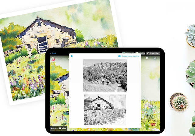
how correct tonal values can improve your paintings


Comparing your painting and reference photo in greyscale to improve your tonal range

Do you find that sometimes your paintings look a bit flat? That they lack sense of depth? That your buildings don't look truly 3-dimesional? Or that your painting lacks vibrancy?

Perhaps you really like the reference photo you were working from, but somehow your painting is missing something that the reference photo has.

Of course, the answer could be many things, but most often when I'm looking at student paintings, what I see is that the tonal values in their paintings could be improved.


What do I mean by tonal values?

One of the important things to get right in your paintings is the correct tonal values - the darks and lights in your painting. To make a painting appear really vibrant, you often need to have a good contrast between light areas and dark areas.


Tonal values tell a story

Depending on the story you're wanting to tell, you might want a painting that is mostly dark (a sombre feel), mostly light (often for a more traditional feel) or to have a good range of both darks and lights (a vibrant feel). 

Probably you chose the reference photo, or the scene you're working from, because it told one of these stories. If you then look at your finished painting and it doesn't feel right, then it can help to look at the tonal range of your painting compared to the tonal range of your reference.


Tonal values help with composition

One of the many tricks to indicate a focal point in your painting is to have the darkest-dark next to the lightest-light in that area. Using this trick helps someone looking at your painting to know where your focal point is.


Correct tonal values help give a painting a sense of depth

Things in the distance are lighter in tone than things that are closer to you. For instance, if you were painting a scene with lots of mountains, then the mountains furtherest away from you would be the palest and then as you got closer to the foreground the mountains would get darker and darker.


Colours can confuse you

Some colours, particularly ones that are bright or vibrant, can look like they're a darker tone than they really are. As you become more skilful, you'll learn to be able to see the tone separately to hue. In the beginning, colours can mislead you. So...


Compare paintings and reference photos in greyscale

To help you judge whether you've got a tonal range in your painting that best matches the reference photo you're working from or tells the story you're after, you should view both your finished painting and your reference photo in greyscale. This is probably one of the quickest tricks that will improve your paintings.

Take a photo of your painting and convert it to greyscale. Do the same for your reference photo. Now compare the two. Removing the colours will instantly tell you whether you've got your tonal values correct. I use this all the time!


Renee's Studio and Real Sketch have tonal value tools

We've included a tonal value tool in both of our apps. These tools allows you to compare a greyscale photo of your painting to a greyscale version of your reference. 

Renee's Studio is for iOS and Real Sketch for Android.

Find Real Sketch on Google PlayStore  and Renee's Studio on Apple AppStore.

I encourage you use them, and see what a difference it makes to your paintings.

Happy painting!