painting vibrant watercolours : 9 tips for you
 |
| Spring meadow - pen & watercolour, 23x30cm |
I’m often asked if there are any tricks to painting vibrant watercolours. I think some people might just be asking how to paint bright, saturated paintings, but vibrancy is about far more than that.
Paintings don’t need to have a colour overload to be vibrant - many cool or neutral paintings have a vibrancy too. I think the answer lies in a kind of illusion, where all the colours in a painting work together, where there is light and space, and, for watercolours, where the paper shines through so that the pigments can glow.
For colours working together - that is about colour theory. For light and space - that’s about composition. But for painting watercolours where the pigments glow, I’ve got the following tips for you...
- Choose artist quality paints:
Artist-grade watercolours contain more pigment and less filler. These saturated colours enhance vibrancy. They’re also not as expensive as they look at first glance, because they contain more pigment than student grade colours they go much further. - Select good quality paper:
When you apply watercolour to paper, the pigments are absorbed into the fibres. This interaction is influenced by the paper’s texture, weight, and absorbency. Pigments don’t just sit on the surface; they become embedded within the paper. Cotton paper has longer fibres, which are less likely to loosen during painting. Quality sizing (the protective coating) also keeps fibres intact. - Layering pigments with care:
Instead of pushing pigments into the paper fibres, layer them gently onto the surface. Repeated brushing can unravel fibres in the paper, leading to a fuzzy appearance. When I paint a stroke of colour I try to avoid excessive pressure, layering gently onto the page, or when working wet-in-wet, into the layer of water on top of the paper. - Allow proper drying between glazes:
Patience pays off! Let each layer dry completely before adding another glaze. This prevents one layer disturbing the others, avoiding muddiness and preserving vibrancy. - Steer clear of opaque glazes:
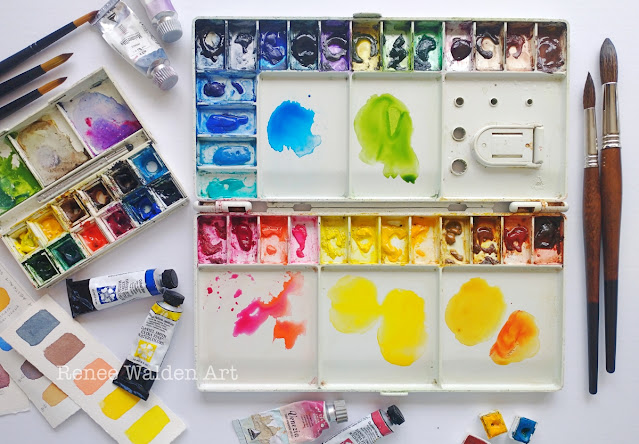
If you look at the colours on my palette you’ll notice that almost all of them are transparent. Transparent glazes allow light to bounce off the paper, creating luminosity. Opaque colours can block this effect. My full palette is listed on my blog under "Tips & Techniques." - Avoid black pigments:
Black pigments can be very dull. Instead, mix complementary colours to achieve dark tones. This livens up your paintings. - Create contrasts:
When we paint we are creating many illusions - illusions of 3 dimensions for instance, or the illusion of the depth. A lot of vibrancy is created with illusions too. When you vary your values—light to dark—you can make your colours pop. A light tone next to a dark tone, can make the light tone seem vibrant in comparison. The same is true for colour contrasts - it’s good to learn a bit of colour theory - Know your pigments and about colour mixing:
Some colours on your palette might be a mix of many pigments. When you mix colours together, if you don’t know what is in your pigments, you might be mixing 4 or 5 pigments together, some of them complimentary. When you mix complimentary colours, at best you’ll get a neutral, at worst you’ll just get mud. If you look at the back of a tube of paint, the list of pigments in the paint is often there. An easier trick is to know what colours on your palette have a warm or a cool tendency - I cover this in more detail in a tutorial on Patreon and Renee’s Studio. - A clean work area and clean tools:
I know this last point sounds pedantic. After all you might have visions of a chaotic artist’s studio with paints and canvasses everywhere. I think this is true when I’m painting in acrylics or mixed media. But for watercolours, I’m far more tidy - no dust, no moisturiser on my hands (grease marks on fine art paper, urg!), refresh your water container regularly and clean your brushes and palettes often - this really makes a difference.
Did you find this article helpful? Join my mailing list for more inspiration, tips & watercolour advice.